
Using Mantine with Tailwind
Wondering how to use Tailwind classes in Mantine components? This is the article you need.


Check out my next-power-starter to quickly get started with Mantine & Tailwind with opinionated configurations!

I noticed that my previous Mantine + Tailwind article on the InstaNext series received a lot of views probably from Google search, so I am dedicating a full article on the topic.
I am a big fan of the Mantine + Tailwind combo and have convinced several people to adopt this combo. While both are quite popular on their own, I guess the combo is still relatively less popular, so I'd like to share a little on how to use them well, and what is so good about this.
PS: The lead of Mantine does not like Tailwind, so you'll never see Tailwind on Mantine documentation, but they go very well together for me.

Quick Intro
Mantine
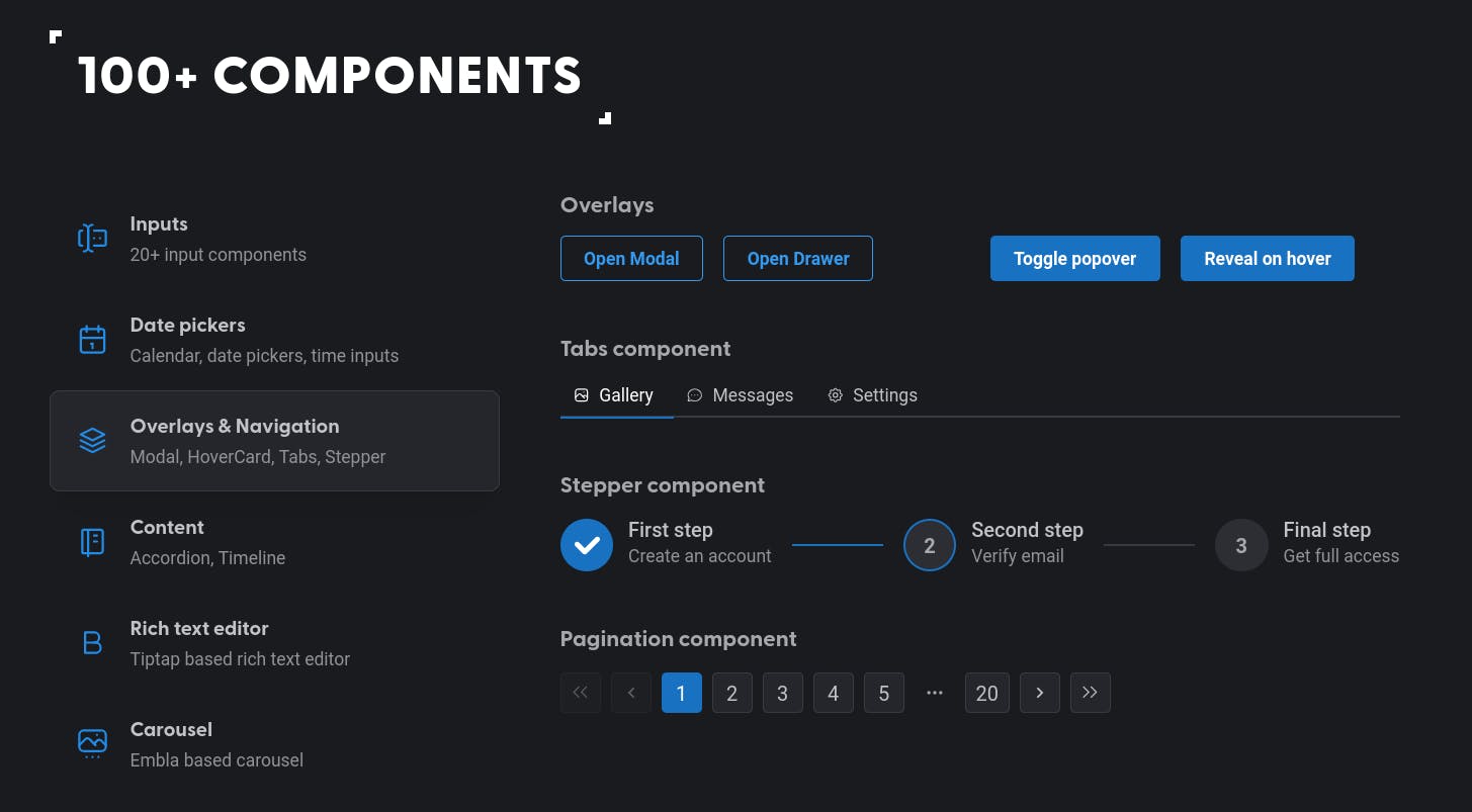
If you don't know about it yet, Mantine is a React component library that provides over 100 components, almost everything that you need in a project.
Beyond that, they also provide a lot of utility hooks, so you almost don't need to install additional utility libraries most of the time.
Tailwind
Meanwhile, Tailwind is a CSS class library. You write classes instead of CSS which is more uniform.
Installation
Let's just say that this is very trivial for starters. You can simply follow the installation guides and install the libraries, and they should be available right away.
Check out the installation page for Mantine and Tailwind. (I'd probably be copying the codes from there even if I include them here)
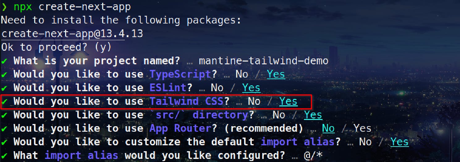
Anyway, I'll include a short guide on installation with Mantine and Tailwind for Next.js (I don't use anything else nowadays)
npx create-next-app
While the other options depend on your preference, make sure you use Tailwind CSS, that'd skip some initial setup things.
To set up Mantine, you'd want to first install the packages. These are the core packages, you can add on other additional packages if you need them.
yarn add @mantine/core @mantine/hooks @emotion/react
Finally, add the necessary theme provider in _app.tsx, the codes are taken from the documentation.
// _app.tsx
import { AppProps } from 'next/app';
import Head from 'next/head';
import { MantineProvider } from '@mantine/core';

export default function App(props: AppProps) {
  const { Component, pageProps } = props;

  return (
    <>
      <Head>
        <title>Page title</title>
        <meta name="viewport" content="minimum-scale=1, initial-scale=1, width=device-width" />
      </Head>

      <MantineProvider
        withGlobalStyles
        withNormalizeCSS
        theme={{
          /** Put your mantine theme override here */
          colorScheme: 'light',
        }}
      >
        <Component {...pageProps} />
      </MantineProvider>
    </>
  );
}
What's good?
I mean even the Mantine project lead dislikes Tailwind, so why am I promoting it?
That's because, for me, Tailwind fills in the gap of Mantine, and Mantine is great.
What's great with Mantine
Many Components
Mantine basically has most of what you need. With other libraries, you might still need to install external libraries for missing components and even need to fix the themes of the extra components.
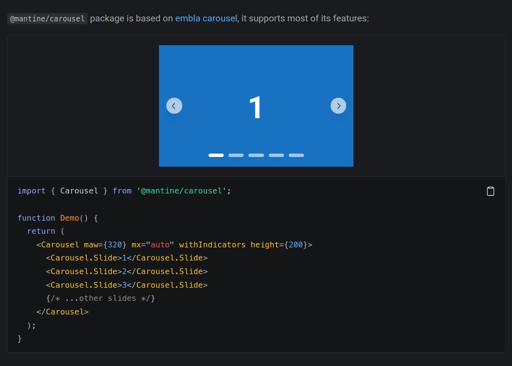
Usually, I look for a Carousel component, and so far Mantine appears to be one of the rare ones that have it out of the box. (Not in the core, but available as one of the packages)
Fun fact, Mantine even provides sample codes for Drag' n' Drop.Customizability
Mantine gives you the power to use CSS classes or even CSS-in-JS to style any part of the component. For example, you can even use CSS selectors
 <Button
   leftIcon={<IconBrandTwitter size={rem(18)} />}
   styles={(theme) => ({
     root: {
       backgroundColor: '#00acee',
       border: 0,
       height: rem(42),
       paddingLeft: rem(20),
       paddingRight: rem(20),
       '&:not([data-disabled])': theme.fn.hover({
         backgroundColor: theme.fn.darken('#00acee', 0.05),
       }),
     },
     leftIcon: {
       marginRight: theme.spacing.md,
    },
   })}
   Follow on Twitter
 </Button>
You can just target the
leftIcon.
The best part is that Mantine does so without having to burden us users with nested components like Headless UI
 // https://headlessui.com/react/listbox
 <Listbox value={selected} onChange={setSelected}>
   <div className="relative mt-1">
     <Listbox.Button className="relative w-full cursor-default rounded-lg bg-white py-2 pl-3 pr-10 text-left shadow-md focus:outline-none focus-visible:border-indigo-500 focus-visible:ring-2 focus-visible:ring-white focus-visible:ring-opacity-75 focus-visible:ring-offset-2 focus-visible:ring-offset-orange-300 sm:text-sm">
       <span className="block truncate">{selected.name}</span>
       <span className="pointer-events-none absolute inset-y-0 right-0 flex items-center pr-2">
         <ChevronUpDownIcon
            className="h-5 w-5 text-gray-400"
            aria-hidden="true"
         />
       </span>
 </Listbox.Button>
While many other libraries do provide this kind of functionality these days, some big popular frameworks still need you to add CSS rules to the components' classes to modify the style (like Ant Design).
Nevertheless, I find this a must-have for myself as it's not uncommon to customize nested parts of a component to match your overall theme.
Nicely Styled

Typically, when people talk about Tailwind, unstyled Headless UI or the new Shadcn are often preferred over styled-components. However, I wouldn't want to create my buttons from scratch, to include styles for variants like outlined, solid, link, etc.
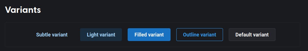
Yes, there are CSS libraries like Daisy UI for that, but I prefer having my life easier at times like this. Most importantly, if the default styles for Mantine is great, why not right?
Of course, for enterprise-level software, where a specific design system has been made, unstyled components might be a better option (but Mantine does provide that too if you need it)
Form Integration
This is one of my favorites, unlike other component libraries that typically rely on React Hook Form for form validation, Mantine provides its own use-form hook out of the box!
 // example using Zod library
 import { z } from "zod";

 const authSchema = z.object({
   email: z.string().email("Invalid email").min(1, "Email is required"),
   password: z.string().min(1, "Password is required"),
 });

 const LoginForm = () => {
   const form = useForm<AuthType>({
     validate: zodResolver(authSchema),
     initialValues: {
       email: "hohshenyien@gmail.com",
       password: "asdf",
     },
   });

   return (
   <form className="space-y-2" onSubmit={form.onSubmit(submitForm)}>
     <TextInput
       label="Email"
       placeholder="example@mail.com"
       variant="filled"
       {...form.getInputProps("email")}
     />
     <PasswordInput
       label="Password"
       variant="filled"
       {...form.getInputProps("password")}
     />
 ...
 }
Not that I dislike react hook form, but sometimes it's a little annoying if the component library isn't directly compatible with it...
Limitation of Mantine
Note: This is totally opinionated, others may find it otherwise.
Insufficient Spacing
To demonstrate what I mean, look at this Stack component
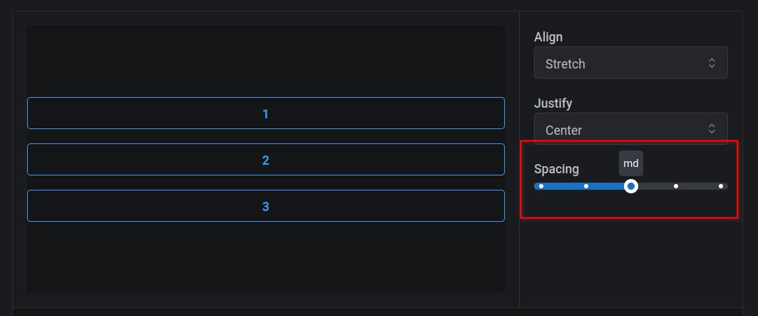
See that 5 values on the Spacing? Yes, Mantine only provides
xs,sm,md,lg, andxl. Want more? You'd have to put values like5px. It's not just limited to this component, it's everywhere, from margin, and padding, to font sizes...Unfortunately, using custom values poses more inconsistencies to me, what if some developers use 5px, and others use 6px? Looks similar enough, but this kind of inconsistency is simply bad.
CSS-in-JS
We all love CSS, yes. However, I don't really like CSS in JS, when Tailwind is present, like look at this
 // https://mantine.dev/core/tabs/#unstyled-tabs
 function StyledTabs(props: TabsProps) {
   return (
     <Tabs
       unstyled
       styles={(theme) => ({
         tab: {
           ...theme.fn.focusStyles(),
           backgroundColor: theme.colorScheme === 'dark' ? theme.colors.dark[6] : theme.white,
           color: theme.colorScheme === 'dark' ? theme.colors.dark[0] : theme.colors.gray[9],
           border: `${rem(1)} solid ${theme.colorScheme === 'dark' ? theme.colors.dark[6] : theme.colors.gray[4]}`,
           padding: `${theme.spacing.xs} ${theme.spacing.md}`,
           cursor: 'pointer',
           fontSize: theme.fontSizes.sm,
           display: 'flex',
           alignItems: 'center',

           '&:disabled': {
             opacity: 0.5,
             cursor: 'not-allowed',
           },
At least for me, I wouldn't want to clutter the TSX file with CSS, and it's not really that readable in my opinion.
Of course, there are also many who love CSS-in-JS, so this is just my preference.
Where Tailwind Fills the Gap
Corresponding to the two points above,
More Variability
Want a bigger gap? Sure, there's a range from
gap-1all the way togap-96, and the same for anything from margin, and padding, to spacing. That's where Mantine lacks and for now, Tailwind fills in perfectly!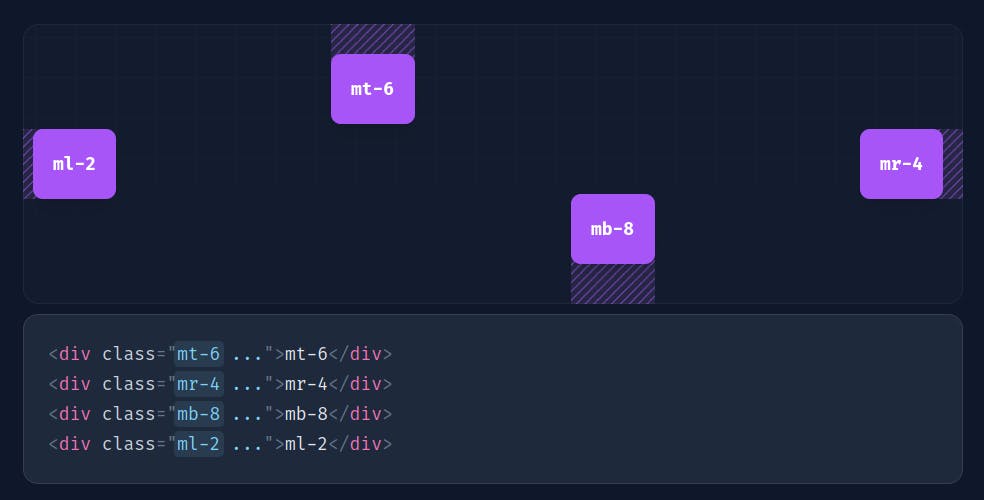
While I do prefer Mantine UI, I do wish for Chakra UI's Style Props in Mantine sometimes.
Readability
Compared to CSS-in-JS, I prefer Tailwind classes, it's like reading variables, and more comprehensible.
Of course, long Tailwind classes are bad, so you still need to somewhat plan your classnames properly.// typical buttons with very very long classnames // which is kinda ugly <button className="inline-flex justify-center rounded-md bg-white px-3 py-2 text-sm font-semibold text-gray-900 shadow-sm ring-1 ring-inset ring-gray-300 hover:bg-gray-"> </button>
Tweaks
While you can certainly start using Tailwind + Mantine at this point, there are still some minor issues. Here are some tweaks that address those issues
Disabling Tailwind Preflight
Tailwind's Preflight is a set of base styles to reset default styles from the browser. For example, headings are unstyled, so your <h1> will look the same as your <p>.
Our only concern will be buttons. Tailwind will reset the background colors of buttons. This means that your buttons will be transparent regardless of the colors you chose for Mantine buttons.
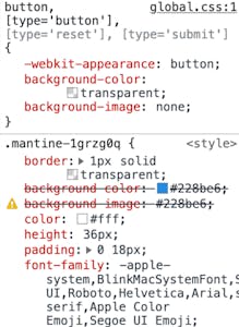
You can see that the Mantine's background colors are overridden by Tailwind's Preflight (global.css), and you certainly don't want an empty button to style yourself right?
To fix that, you will first need to disable Tailwind's Preflight in tailwind.config.js
// tailwind.config.js
module.exports = {
  corePlugins: {
    preflight: false, // This line is important
  },
  ...
}
However, you might still want to include other rules, for example, I dislike seeing an underline on my link buttons.
You can always download a raw copy of the preflight and remove the rules that you dislike. That's what I did in my next-power-starter package where I removed that rule that resets buttons' backgrounds, check out the updated preflight.
Of course, don't forget to include the updated preflight.css in your _app.tsx
// _app.tsx
import "@/styles/preflight.css";
Before this, I added the styles manually to my buttons because of Tailwind 🥲
Theming Mantine with Tailwind
Let's take a look with the colors, I'll just take blue for example
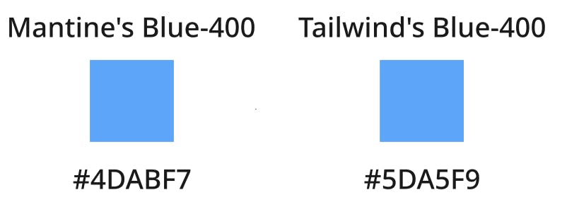
They kinda look similar, but not exactly the same, and the last thing you want is to have different sets of colors everywhere. Some buttons have darker blue while others are lighter blue.
Does this limit us to using only one of the colors? NO
While it is somewhat tedious, the easiest way is to define tailwind colors in Mantine (or Mantine's colors in Tailwind, if you prefer it that way)
Typically, I'd create a Mantine theme file to define a customized theme and pass it to the MantineProvider like this
// styles/MantineTheme.ts
const tailwindColors = {
  gray: [
    "#F9FAFB",
    "#F3F4F6",
    "#E5E7EB",
    "#D1D5DB",
    "#9CA3AF",
    "#6B7280",
    "#4B5563",
    "#374151",
    "#1F2937",
    "#111827",
  ],
   ...
}

const theme: MantineThemeOverride = {
  colors: tailwindColors,
  colorScheme: "light",
};

export default theme;
// _app.tsx
import theme from "@/styles/MantineTheme";
...
<MantineProvider withGlobalStyles withNormalizeCSS theme={theme}>
...
Check out the complete Tailwind colors in Mantine here. (I think it still misses a few colors, I got it from ChatGPT)
Tips & Tricks
Conditional Classes
When it comes to conditional classes, e.g., div needs to be red if variable is 1 or green otherwise? Typically, this is done using a ternary operator like this
<div className={variable === 1 ? "bg-red-400" : "bg-green-400"}>
</div>
But what if the condition is complex? Say in addition to the condition above, you wanna make the div orange if it's 2
<div
  className={variable === 1 ? "bg-red-400" :
                variable === 2 ? "bg-orange-400" : "bg-green-400"}>
</div>
Kinda messy right? Imagine having more conditions and classes, it's going to be insane!
But yeah, basically Tailwind, as it is, will be really messy, so what to do?
The clsx API
Not an additional package, you can import directly from Mantine/core
import {clsx} from "mantine/core";
Simply pass the classnames as keys, and the boolean variable as value, clsx will parse it into the right string
<div
  className={clsx({"bg-red-400": variable === 1,
                    "bg-orange-400": variable === 2,
                    "bg-green-400": variable !== 1 && variable !== 2})}>
</div>
It is somewhat longer, but it's more readable.
clsx is always a handy function to use everywhere, it can also help concatenate the classes from arrays, string literals, variables, and objects:
<div
  className={clsx("bg-red-400", someVar, {"bg-red-400": variable === 1})}>
</div>
Targeting Subclasses
As mentioned earlier, everything in Mantine is stylable, so to apply Tailwind in Mantine, the best way is via classNames props. (notice the extra "s")
For example, looking at the tabs, you might want to only color the texts and not the icons, so open up your inspector (or check the Styes API)
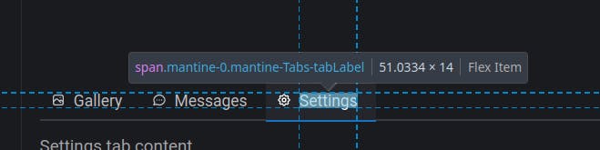
Notice that there's a tabLabel in the class? (the last string) Yupp, that's the target class for classnames, so to set the colors for the texts
// pass the tailwind classes as values to the target keys
<Tabs classNames={{tabLabel: "text-red-400"}}>
As simple as that!
Conclusion
Using the tips and tweaks above, your experience with Mantine + Tailwind should be wonderful! There is no limit to this combo, and everything has been pleasant as of now.
Once again, this is from my personal experience of using them, which is around a year now, I hope this article can benefit you as much!
Check out my next-power-starter to quickly get started with Mantine & Tailwind with opinionated configurations!